A Lesson on Color Theory: How to Elevate Your Home
Color has a powerful influence on how a home feels, even before furniture or décor is added. It affects mood, perception of space, and how individual rooms connect to one another throughout the home. When homeowners begin to design a home, color choices work best when they are intentional rather than reactive.
Walls, floors, window treatments, countertops, and fixtures all contribute to a unified visual experience, not isolated moments of style. Without a basic understanding of color theory, it is easy to combine finishes that compete instead of complementing one another. This often results in spaces that feel disjointed, even when high-quality materials are used.
The Role of Color in Interior Design
Color theory begins with understanding how hues interact and how they are perceived under different lighting conditions. Warm tones tend to advance visually, while cool tones recede, subtly influencing how open or intimate a space feels.
Natural light plays a critical role in how color behaves. A shade that appears balanced in a showroom may feel stark or muted once installed in a sun-filled room. Evaluating colors in their intended environment is essential.
Undertones also matter. Whites can lean warm or cool, and neutrals often carry hidden color influences. Recognizing undertones helps prevent clashes between floors, walls, and fixed finishes.
Maintaining undertone consistency throughout the home creates flow. While individual rooms can vary, shared undertones help the overall interior feel cohesive rather than fragmented.

Coordinating Walls, Floors, and Window Treatments
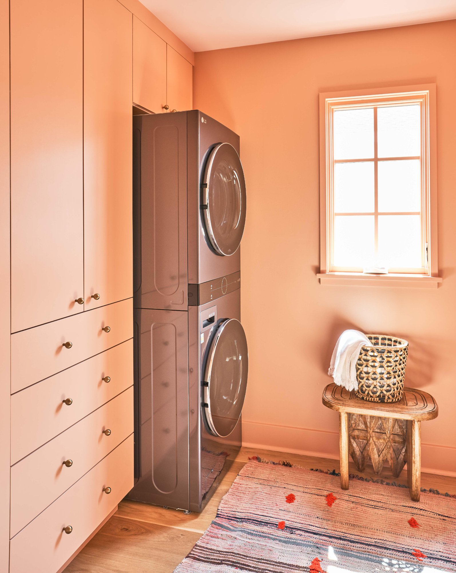
Walls typically serve as the visual foundation of a room. Neutral wall colors provide flexibility, allowing flooring and furnishings to introduce depth without overwhelming the space.
Flooring grounds the design and should be selected with longevity in mind. Mid-tone wood, natural stone, and neutral tile options work across a wide range of styles and color palettes.
Window treatments bridge walls and floors. Curtains and shades soften hard surfaces while reinforcing the overall color direction. They should relate to surrounding finishes without matching them exactly.
Successful coordination relies on balance. Calm wall colors paired with textured floors and layered window treatments add depth without visual clutter.
Using Color to Achieve Different Design Styles
Color theory helps define the emotional tone of a space. When homeowners design a home with a clear stylistic direction, color becomes a powerful tool for reinforcing that intent.
Luxury interiors rely on depth and controlled contrast. Rich neutrals, layered tones, and restrained accent colors create a refined and polished feel.
Modern spaces benefit from simplicity. Clean neutrals, limited color variation, and intentional contrast support a streamlined, current aesthetic.
Classic and cozy interiors depend on warmth and familiarity. Softer contrasts, natural materials, and warm-toned palettes promote comfort and timelessness.
Common shade approaches include:
- Luxury styles using layered creams, charcoals, deep blues, and warm metallic accents
- Modern interiors favoring whites, grays, black accents, and muted natural tones
- Classic designs incorporating warm neutrals, soft blues, and traditional patterns
- Cozy homes relying on warm whites, earth tones, and textured fabrics
These palettes work best when applied across multiple surfaces rather than isolated to a single feature.
Choosing Colors for Fixtures and Permanent Surfaces
Fixed elements such as countertops, cabinetry, and tile carry significant visual weight. Because these features are not easily changed, color selection should prioritize longevity.
Natural stone often introduces subtle color variation that can guide surrounding choices. Pulling secondary tones from stone into wall colors or fabrics helps unify the space.
Cabinetry color influences light and contrast. Lighter finishes reflect light and feel open, while darker cabinetry adds definition when balanced carefully.
Fixtures and hardware offer subtle opportunities for contrast. Finishes like brushed metals or matte black reinforce a palette without dominating it.
Color Theory Do’s and Don’ts When Used to Design a Home
Applying color theory effectively requires both confidence and restraint. Understanding common missteps helps avoid costly or visually disruptive outcomes.
Testing combinations together is essential. Viewing wall colors, flooring, fabrics, and finishes side by side reveals interactions that individual samples cannot.

Balance should always take priority over variety. Too many competing colors create visual noise, while a controlled palette promotes calm and continuity.
Key do’s and don’ts include:
- Do repeat undertones throughout the home
- Do let one element lead while others support
- Do test colors in real lighting conditions
- Do not rely on trends for permanent finishes
- Do not mix warm and cool tones without intent
Following these principles helps ensure color choices enhance the overall design.
Using Color Theory to Design a Home With Intent
Color theory provides a practical framework for making cohesive design decisions. When applied thoughtfully, it aligns walls, floors, fabrics, and fixtures into a unified whole.
Homes that use color intentionally tend to feel more balanced, comfortable, and visually refined. These decisions influence not only appearance, but also how spaces are experienced day to day. Planning these choices early leads to stronger outcomes and fewer compromises.
At Konrady & Son Construction, we build custom homes and perform renovations with intention. Whether you’re looking to update existing interiors or design and build your future home, we’re here to help. Contact us today.